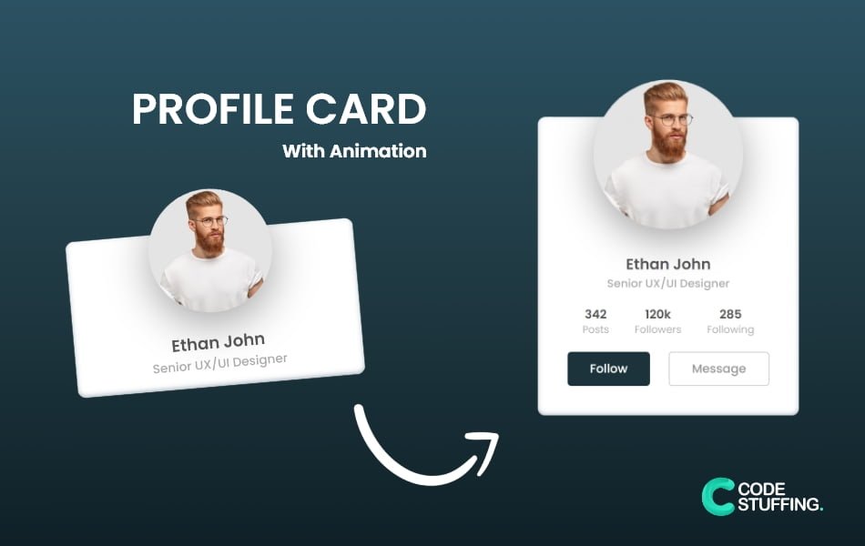

Animated Profile Card is based on pure Html5, Css3, and Js. This snippet does not have any framework. This snippet is used to add team profile cards and other sorts of animated cards.
Use the below code to make the website more interactive, it’s kind of but not fully user-friendly.
HTML Code:
<div class="cs_card">
  <div class="imgBx"><img src="profile.webp" alt=""></div>
  <div class="cs_content">
    <div class="cs_details">
      <h2>Ethan john <br><span>Senior UX/UI Designer</span></h2>
      <div class="cs_data">
        <h3>342 <br><span>Posts</span></h3>
        <h3>120k <br><span>Followers</span></h3>
        <h3>285 <br><span>Following</span></h3>
      </div>
      <div class="actionBtn">
        <button>Follow</button>
        <button>Message</button>
      </div>
    </div>
  </div>
</div>
CSS Code:
@import url('https://fonts.googleapis.com/css?family=Poppins:100,200,300,400,500,600,700,800,900');
*{
  margin:0;
  padding:0;
  box-sizing:border-box;
  font-family:'Poppins',sans-serif;
}

body
{
  display: flex;
  justify-content:center;
  align-items:center;
  min-height:100vh;
  background: linear-gradient(to top, #0f2027, #203a43, #2c5364); /* W3C, IE 10+/ Edge, Firefox 16+, Chrome 26+, Opera 12+, Safari 7+ */
}
.cs_card
{
  position:relative;
  top: 60px;
  width:350px;
  height:190px;
  background:#fff;
  border-radius:10px;
  box-shadow: rgba(50, 50, 93, 0.25) 0px 50px 100px -20px, rgba(0, 0, 0, 0.3) 0px 30px 60px -30px, rgba(10, 37, 64, 0.35) 0px -2px 6px 0px inset;
  transition: 0.6s all;
}
.cs_card:hover{
  height:400px;
}
.imgBx{
position:absolute;
left:50%;
top:-50px;
transform:translateX(-50%);
width:150px;
height:150px;
background:#fff;
border-radius:50%;
box-shadow: rgba(50, 50, 93, 0.25) 0px 50px 100px -20px, rgba(0, 0, 0, 0.3) 0px 30px 60px -30px, rgba(10, 37, 64, 0.35) 0px -2px 6px 0px inset;
overflow: hidden;
transition: 0.6s all;
}
.imgBx img
{
 position:absolute;
 top:0;
 left:0;
 width:100%;
 height:100%;
 object-fit:cover;
}
.cs_card:hover .imgBx{
    height: 200px;
    width: 200px;
}
.cs_card .cs_content
{
 position:absolute;
 width:100%;
 height:100%;
 display:flex;
 justify-content:center;
 align-items:flex-end;
 overflow: hidden;
}
.cs_card .cs_content .cs_details
{
 padding:40px;
 text-align:center;
 width:100%;
 transition:0.5s;
 transform: translateY(150px);
}
.cs_card:hover .cs_content .cs_details{
    transform: translateY(0px);
}

.cs_card .cs_content .cs_details h2
{
 font-size:1.25em;
 font-weight:600;
 color:#555;
 line-height:1.2em;
}
.cs_card .cs_content .cs_details h2 span
{
 font-size:0.75em;
 font-weight:500;
 opacity:0.5;
}
.cs_card .cs_content .cs_details .cs_data{
 display:flex;
 justify-content:space-between;
 margin:20px;
}
.cs_card .cs_content .cs_details .cs_data h3
{
 font-size:1em;
 color:#555;
 line-height:1.2em;
 font-weight:600;
}
.cs_card .cs_content .cs_details .cs_data h3 span
{
 font-size:0.85em;
 font-weight:400;
 opacity:0.5;
}
.cs_card .cs_content .cs_details .actionBtn{
 display:flex;
 justify-content:space-between;
 /*gap:20px;*/
}
.cs_card .cs_content .cs_details .actionBtn button
{
 padding:10px 30px;
 border-radius:5px;
 border:none;
 outline:none;
 font-size:1em;
 font-weight:500;
 background:#203a43;
 color:#fff;
 cursor:pointer;
}
.cs_card .cs_content .cs_details .actionBtn button:nth-child(2)
{
 border:1px solid#999;
 color:#999;
 background:#fff;
}
#BeingCodeStuffer