
Creative Cards Tilt Animation is based on pure Html5, Css3, and Js. This snippet does not have any framework. This snippet is used to add showcase your featured services in this fancy and modern Ui snippet. Use the below code to make the website more interactive, it’s kind of but not fully user-friendly.
HMTL Code:
<div class="gl_container">
<div class="gl_card">
<div class="gl_content">
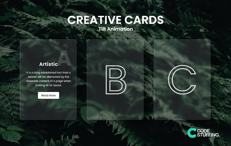
<h2>A</h2>
<h3>Artistic</h3>
<p>
It is a long established fact that a reader will be distracted by the readable content of a page when
looking at its layout.
</p>
<a href="#">Read More</a>
</div>
</div>
<div class="gl_card">
<div class="gl_content">
<h2>B</h2>
<h3>Beautiful</h3>
<p>
It is a long established fact that a reader will be distracted by the readable content of a page when
looking at its layout.
</p>
<a href="#">Read More</a>
</div>
</div>
<div class="gl_card">
<div class="gl_content">
<h2>C</h2>
<h3>Creative</h3>
<p>
It is a long established fact that a reader will be distracted by the readable content of a page when
looking at its layout.
</p>
<a href="#">Read More</a>
</div>
</div>
</div>
CSS Code:
*{
    margin: 0;
    padding: 0;
    font-family: poppins;
    box-sizing: border-box;
}
body{
    display: flex;
    justify-content: center;
    align-items: center;
    min-height: 100vh;
    background:url(bg.jpg) center center no-repeat;
    background-size: cover;
}
body:after{
    content: '';
    width: 100%;
    height: 100%;
    background-color: rgba(0, 0, 0, 0.344);
    position: absolute;
}
.gl_container{
    position: relative;
    display: flex;
    justify-content: center;
    align-items: center;
    max-width: 1200px;
    flex-wrap: wrap;
    z-index: 1;
}
.gl_container .gl_card{
    position: relative;
    width: 340px;
    height: 480px;
    margin: 30px;
    box-shadow: 20px 20px 50px rgba(0, 0, 0, 0.5);
    border-radius: 15px;
    background:rgba(255, 255, 255, 0.1);
    overflow: hidden;
    display: flex;
    justify-content: center;
    align-items: center;
    border-top: 1px solid rgba(255, 255, 255, 0.5);
    border-left: 1px solid rgba(255, 255, 255, 0.5);
    backdrop-filter: blur(5px);
}
.gl_container .gl_card:after {
    content: '';
    width: 100%;
    position: absolute;
    height: 100%;
    display: flex;
    transition: 0.6s;
    align-items: center;
    color: transparent;
    text-shadow: 0px 0px 10px;
    font-size: 15rem;
    justify-content: center;
    -webkit-text-stroke-width: 5px;
    -webkit-text-stroke-color: #e3e3e3;
}
.gl_container .gl_card:nth-child(1)::after {
    content: 'A';
}
.gl_container .gl_card:nth-child(2)::after{
    content: 'B';
}
.gl_container .gl_card:nth-child(3)::after {
    content: 'C';
}
.gl_container .gl_card:hover:after {
    opacity: 0;
}
.gl_container .gl_card .gl_content{
    padding: 20px;
    text-align: center;
    transform: translateY(100px);
    transition: 0.8s;
    transition-delay: 0.6s all;
    opacity: 0;
    z-index: 10;
}
.gl_container .gl_card:hover .gl_content{
    transform: translateY(0px);
    opacity: 1;
}
.gl_container .gl_card .gl_content h2{
    position: absolute;
    top: -90px;
    right: 30px;
    font-size: 8em;
    color: rgb(255 255 255 / 15%);
    pointer-events: none;
}
.gl_container .gl_card .gl_content h3{
    font-size: 1.8em;
    color: #fff;
    z-index: 1;
    font-weight: 600;
    margin-bottom: 1rem;
    letter-spacing: 1px;
}
.gl_container .gl_card .gl_content p{
    font-size: 1em;
    color: #fff;
    margin-bottom: 1.8rem;
    font-weight: 300;
}
.gl_container .gl_card .gl_content a{
    position: relative;
    display: inline-block;
    padding: 8px 20px;
    background: #fff;
    color: #000;
    border-radius: 5px;
    text-decoration: none;
    font-weight: 500;
    box-shadow: 0 5px 15px rgba(0, 0, 0, 0.2);
}
Tilt Js Code:
$('.gl_card').tilt({
    max: 15,
    speed: 400,
    glare:true,
});
Tilt Js CDN:
Use the below CDN for tilt hover animation:
<script src="https://cdnjs.cloudflare.com/ajax/libs/jquery/3.6.0/jquery.min.js"></script>
<script src="https://cdnjs.cloudflare.com/ajax/libs/tilt.js/1.2.1/tilt.jquery.min.js"></script>
#BeingCodeStuffer